![[feature] According to The Experts, Here are The Wallpaper Ideas and Trends You Should Be Aware Of](https://blogger.googleusercontent.com/img/a/AVvXsEheiFiz6cpWJlG3dV-30V6XyYMOs7u15i2onVujMuvcOUuG_kiRstxdYwPLXC8hUuDxDmQuGUD3tdJwJ5X0TCl7Z9tXJvBubIMwydtPY-1ryT_MATgsVjA2ukLcoHbOQVPWWncYzseF43ezeTsUL8G09y83BfyTNg7atC3pXgMbr21INyuszsoOEZSH=s16000) |
| © Provided by Good Housekeeping |
Hanging wallpaper is one of the easiest ways to change the mood of your house and express your personality. And there’s never been such a range of options, from oversized florals to cool geometrics or subdued pastels.
But which patterns do interiors experts use in their own rooms, and how can you make them work for you? We asked the experts to find out all the upcoming trends and source wallpaper ideas and inspiration for every room in the house.
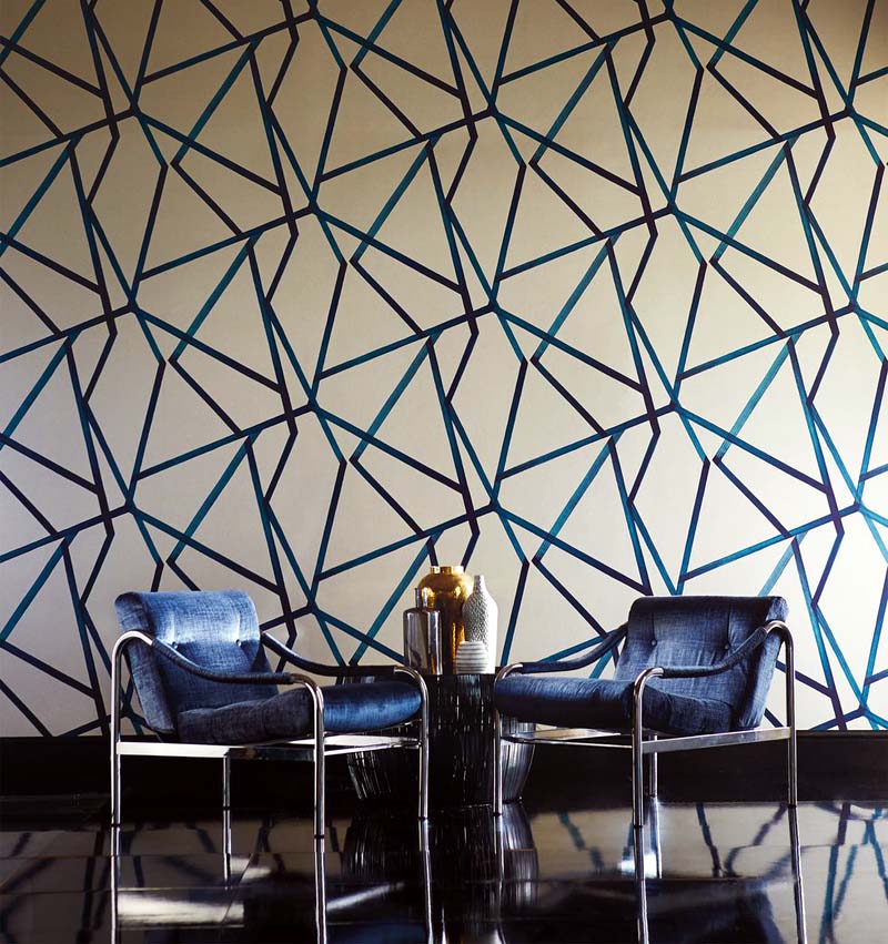
Graphic geometrics
 |
| © Provided by Good Housekeeping |
Claire Greenfield, Lead Designer, Harlequin
“I absolutely love geometrics, they’re my favourite pattern. They work so well across different scales, create a strong look and make a statement, plus they’re not gender-specific. Before I moved recently, I had our Sumi paper in my hall in the gold colourway so that the light hit it, and it created a lovely impact when someone walked into the house.
“People make mistakes when they don’t go with the wallpaper they love. Choose the one that makes your heart beat a bit faster. Don’t always go with the safe option – find what resonates with you, be bold and go for it!”
Read More: 6 Wardrobe Decluttering Golden Rules
Pretty vintage
 |
| © Provided by Good Housekeeping |
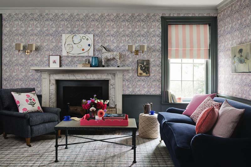
Kate French, Creative Director, Dado
“I love a decorative look, with a pretty feel and a soft, elegant colour palette. I have our Paisley wallpaper in my hallway, which forms a beautiful stripe that takes your eye up the stairs. I also hang a lot of artwork on wallpaper and I love the layering it creates – it gives the space texture and interest.
“I’m seeing people being brave and wallpapering all four walls and the ceiling, going up and over. But wallpaper also works in nooks and crannies – under your stairs, inside bookshelves, in reading corners. It’s like fashion: you might want to wear a black coat, but have a colourful lining. People are also pairing wallpaper with painted woodwork, picking out colours from the paper to use on their skirting boards and window frames. I like it when wallpaper is used in unexpected ways.”
Big and bold
 |
| © Provided by Good Housekeeping |
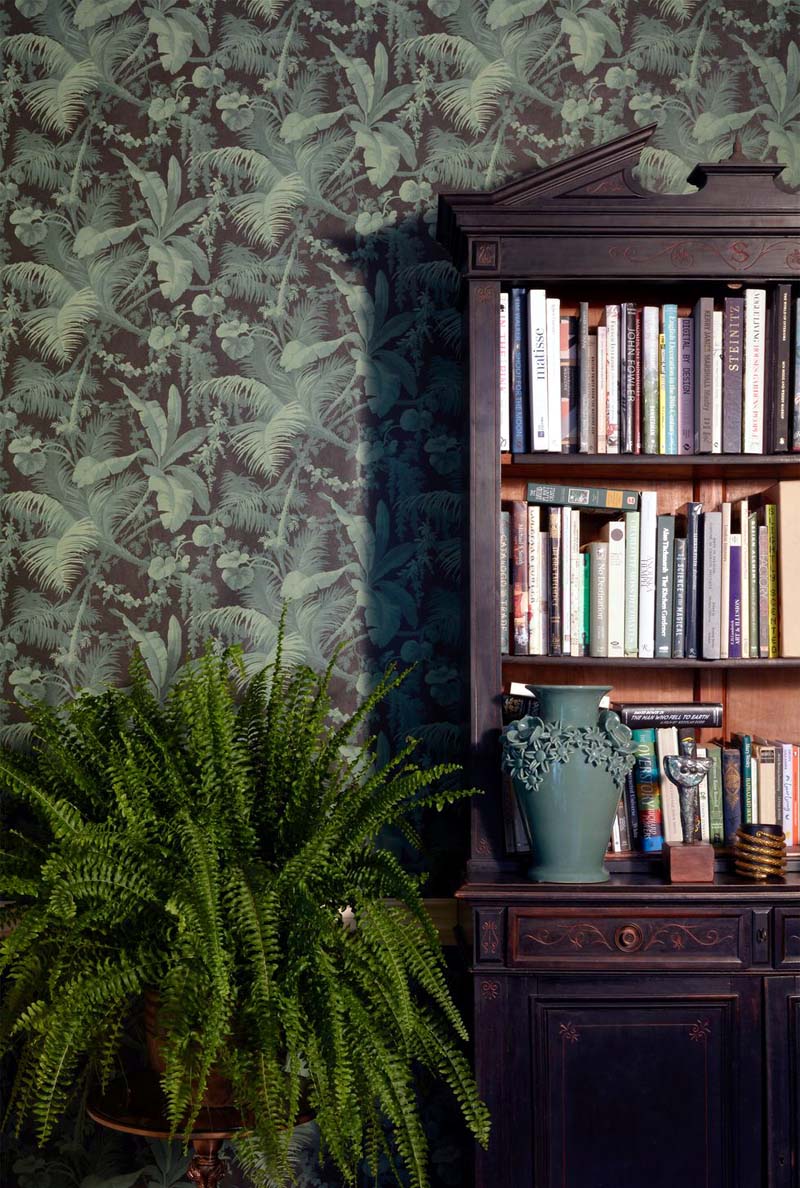
Steve Corcoran, Design Consultant, House of Hackney
“If you want to use a large, bold print, be brave. I love playing with scale in a room. A large-scale print in a small room is so atmospheric – it gives you the feeling of being enveloped inside an organic world of print. If you’ve already got a dark room, there’s no point in making it something it isn’t, so it’s fun to play on that, embrace it and go moody and dramatic. And you can change the soft furnishings in your room for different seasons – use a lighter linen cushion in the summer and a darker velvet cushion in the winter.
“At the moment my favourite print is Plantasia, which I’ve used on a large wall in my sitting room. It’s a mural print of a scenic landscape, so it feels airy and light but very dramatic and beautiful close up. You have this panoramic feel, which is quite romantic – you feel like you’re peeking out through the treetops.”
Decorative bathrooms
 |
| © Provided by Good Housekeeping |
Patrick O’Donnell, International Brand Ambassador, Farrow & Ball
“I love decorated bathrooms. Quite often bathrooms are perceived as utilitarian spaces, but there’s no reason why they can’t be lovely – I recently redecorated mine using an 18th-century wallpaper design, Orleans Stripe. It’s so delicate and elegant. Because bathrooms have all that hard sanitaryware and tiles they can feel cold and sterile, so adding wallpaper lends character and gives a room more depth.
“If your ventilation is good, wallpaper is perfectly suitable for a bathroom. We’ve got windows in our bathroom, and it never steams up, plus Farrow & Ball wallpapers are glazed, so will tolerate some splashing. I wanted the stripes of my wallpaper to echo in the tiles, so I used 30cm-high brick tiles around the bath, but some people recommend tiling 40cm high to protect the wallpaper.
“I always tell people to make sure they order enough rolls of wallpaper – if you have to reorder it, it might come from a different batch and have colour variations. Also, be careful with wallpaper paste, as the last thing you want is paste all over the design.”
Mesmerising murals
 |
| © Provided by Good Housekeeping |
Hayley McAfee, Design Director, Villa Nova
“We’re all using our homes in a different way now, and people want something that’s going to uplift them. Murals are a talking point and look like pieces of art in themselves. Our new collection is a collaboration with potter and artist Kyra Cane – her patterns and textures translate into incredible wallpapers.
“People can be a bit worried about murals; they think you need huge rooms and you have to step back from it to appreciate it, but you don’t. Use furniture against a mural to create nice compositions – for instance if you’ve got a sideboard you can change it up, swapping out black pots for pink pots, to pick up the colours in the paper.
Read More: How to Renovate a Living Room
“My young daughter has our Dusky Amazon mural in her bedroom. She never gets bored of it – it grows with her. The rest of the walls were painted in a soft pink paint, but now she wants to change it to a teal, like the leaves in the design. So you can always change the room around and keep the wallpaper.”
Chic chinoiserie
 |
| © Provided by Good Housekeeping |
Ruth Mottershead, Creative Director, Little Greene
“Chinese wallpapers are playful and harmonious, usually featuring flowers and birds. Their trailing patterns are quite dreamlike and enchanting, almost magical. I think that’s why people like to use them, as a kind of escape – they’re a little bit special.
“We found the Massingberd Blossom paper in Lincolnshire’s Gunby Hall and used it for our new National Trust collection. We’ve made a grey version that’s like the original, and we’ve also translated it into calm and tranquil tones that are good for bedrooms. Then we have more vibrant, livelier colours for kitchens, hallways and downstairs loos! All the wallpaper in my own home has a natural element to it. In my kitchen I’ve used a peacock-feather design in a neutral scheme on all four walls. It’s intricate, but still feels relaxing.”
See more at Good Housekeeping


