![[feature] How To Make a High Street Kitchen Look More Expensive](https://blogger.googleusercontent.com/img/a/AVvXsEiTFM2zidhLX6rn4L1Yusx0QJLgrX6ZS8YrmV6d9SRxFMo6P9UaKxzP7FbIPzc4tCDr_8xBsPv2xoPy67h9ad-ZRTCTnejRBhX1OD1eEgFCY8oUZ2Bg_OizgKs54n3NFg-ijU1EOoydqjYtsXTJl-CmNwZhObyfmmF_vZubiImWbNMNFjhNucBHWwUA=s16000) |
| © Provided by House & Garden |
However much we might fantasise about bespoke cabinetry, a four-oven Aga and miles of marble, the reality is that the Plain English dream is not possible for everybody. Happily, when it comes to kitchens there are excellent off-the-shelf options, and – while you may not get quite the same glide when opening a drawer, or hear that satisfying soft thwunk when closing it – with a bit of thought and the application of some well-honed decorating tricks, almost anything can be made to look less high street and more hand-crafted. Alongside is the importance of the kitchen reflecting the life and taste of its keeper; if you love colour and pattern, then embrace it. If you want something quieter, there are ways of creating a calm, light space that works in an orderly fashion. Whether you’re starting from scratch or tweaking what you’ve got, making it definitively ‘yours’ is what curbs a catalogue finish.
Nail the layout
Wherever your kitchen is from, the cabinets are the most important element to get right, preferably first time. As Nicola Harding says in her helpful How To with House & Garden kitchen course, “to come back and revisit them further down the line is messy, invasive and expensive.” Even on the high street there are consultants who can help you ensure that the bones of the room will look their best (few things say ‘cheap’ faster than unsightly gaps amid what are meant to be fitted cabinets) and, having done it a thousand times before, they might think of things that you haven’t. And yet, don’t be afraid to say “Actually, I’d really like the dishwasher to be immediately to the right of the sink so that I can rinse and stack,” – if indeed that is what you want. “You’ve got to let them know how you operate in your kitchen, ergonomics are very important!” points out Sarah Vanrenen of Vanrenen GW Designs.Think about the visuals, too. Martin Brudnizki, the designer behind some of the most luxurious hang-out spots in the world, including Annabel’s, has used Ikea cabinetry in the kitchen of his West London flat – not that you would ever guess. “Often a sense of ‘wow’ factor can come from the way you configure the room,” he says. “Perhaps you’ll opt to centralise the oven or Aga so it creates the illusion of being the fireplace of the kitchen, or you create a sense of sociability through introducing banquette seating around a large dining table.”
Fitted cabinets are not everything…
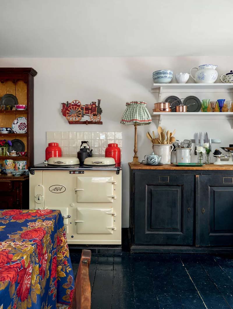
Variety, they say, is the spice of life – and nobody aspires to the drab of endless identical cupboard doors. Nor is that look compulsory. Consider your space – is it a kitchen? Or is it part of a larger room with a kitchen in it? If the latter, forgoing some (or all) top cabinets leaves more room for plants and prints (another method of introducing Martin’s ‘wow’ factor, and one he has employed) while open shelves can look attractive piled with your favourite cookery books, coloured glass and decorative china – or given a more minimalist treatment with pale porcelain. Either idea immediately draws the eye from more pedestrian components. (If, however, you live in a house that breeds dust, doors are your friend – but do consider glass-fronted, especially if the room is small – the depth you’ll see gives the impression of more space.)Equally, not everything has to be fitted; standard cabinets can be combined with standalone furniture, whether a Welsh dresser or a vintage butcher’s block. There are two particular instances when this really pays; first, when your kitchen is an unusual shape – pret-a-porter isn’t kind to uneven proportions – and second, if you’re renting. Alexandra Tolstoy has combined purpose-built with antique to great effect in her kitchen in London.
 |
| © Provided by House & Garden |
If you’re changing up an existing kitchen, and you’re planning to keep the flooring, do check that it goes under any excess bottom cabinets you are thinking of ripping out, or have a plan in place to make good.
Read More: How to Renovate a Living Room
And, if you do have the budget for some cabinetry and space for a table, banquette seating will always look more considered and tidier than an array of chairs.
…but even those fitted units can become unique
There’s not much a lick of paint can’t improve, and many are those who inherited kitchens and made them their own by repainting the units, from Pandora Sykes to Sophie Warburton. If the cupboards have been spray-painted it’s a tougher challenge, but Nicola suggests taking them to a car workshop, saying that most are happy to oblige. If they really aren’t salvageable, remember that standard carcasses will take standard doors.Next, any shelves can be given extra interest with the addition of decorative plywood mouldings; Etsy is a great resource, whether you’re looking for beads, scallops or something else entirely, and Mad Honey London has a covetable wavy trim. If you’re particularly talented, you could take inspiration from artists such as Melissa White or Cressida Bell, and add further ornament via painted pattern or foliage.
 |
| © Provided by House & Garden |
Then, “lovely handles do give a more luxurious look,” points out Sarah. An older kitchen might benefit from new hardware, even from Ikea (it’s genuinely high quality, and as such is often used at a much higher end by custom cabinet makers). Alternatively, Martin gets a lot of his from SA Baxter while Nicola recommends, again, Etsy. If you’d prefer vintage, which can bring patina to a brand new kitchen, antiques markets occasionally throw up some treasure. By no means do all handles have to match, though it will look more unified if they all have a similar finish.
aps and sinks
There is an astonishing number of incredibly expensive sinks and taps available, and some of them are so beautiful – crafted from beaten copper or integrated into a marble worktop as part of the same piece – that you can see why. However there are also lots of lovely sinks to be found at local auctions, reclamation yards and elsewhere (we dug two Belfast sinks out of our garden) or new, from a kitchen shop or John Lewis. The simplest shapes tend to look the chicest, regardless of whether you choose ceramic or stainless steel, and the same goes for taps. |
| © Provided by House & Garden |
Antique taps, like antique sinks, can look exquisite – but, warns Nicola, who has one in her kitchen, “they do come with a bit of a health warning, it’s not always straightforward linking them up with newer pipe work, and they do sometimes drip or leak.” Know that the finish on your taps doesn’t have to chime with the cupboard handles; you don’t have to choose chrome or brass and then stick to one or other religiously throughout. Chances are that a stainless steel tap will speak to the American-style fridge, or the hob, even if the handles are brass – and again, it helps avoid the ‘I bought everything in one shop’ conclusion.
(A Quooker tap, incidentally, does not make your kitchen look more expensive. It makes your kitchen look like it was arranged by someone who loves gadgets. If that’s you, go for it.)
Lighting
If you are into gadgets, this is where you come into your own. More than one circuit in a kitchen gives you a choice as to what is lit at any one time; the dining area, if it is in the same room, should be on a separate circuit to the functional area of the kitchen. It also means that you can decide what people are going to notice, via, perhaps, having an artwork in your kitchen with its own light. Incorporate dimmers, and you’re also in charge of how well everything can be seen, and the atmosphere you want to create. Recessed spotlights – unless you already have them or really love them – are usually less attractive than actual lights.Consider the material that lines the shade, whether a pendant ceiling light or wall-mounted downlights; brass or copper will cast a softer glow than a colder metal. An antique glass lantern that still has the original glass will bring texture to the lighting and thus the whole room – which is particularly good at making very flat-fronted, machine-generated cabinets look less so. And if you want to bring in some genuine softness, there’s no reason not to include a lamp with a fabric shade (though it probably shouldn’t be immediately next to anything that could spit on it, i.e. the hob where you’re boiling stock).
What’s on top matters
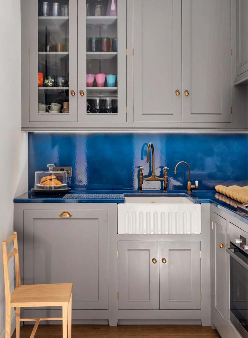
One of the quickest and easiest (though not necessarily cheapest!) means of improving the aesthetics of any kitchen is to add bespoke countertops. “Marble or stone, which is always cool to the touch, is a valuable commodity in a hot, steamy kitchen,” says Nicola – making that financial outlay seem particularly vital if you’re someone who does a lot of cooking, and the room is small or low ceilinged. Martin believes that “every kitchen should have some marble, it instantly adds a sense of glamour. And whilst it is an investment, it’s worth it in the long run.” He sourced “a beautiful calacatta” to top his Ikea cabinets.Granite and quartz are less expensive, though still more costly than wood, which itself is more than laminate – the default material of choice for military quarters, midmarket rental properties, holiday lets, and student accommodation. Laminate never suggests luxury.
 |
| © Provided by House & Garden |
However if you accidentally spent your stone budget on soft furnishings, you could – with the help of a Youtube video or two – attempt your own cast-in-place concrete countertops. Writing from experience and disregarding the labour (my husband’s) the cost is approximately £6 a square metre. And concrete doesn’t have to be grey; use Snowcrete (made of white Portland stone) and add dye as required.
Tiles and splashbacks
This is another area where you can easily imbue ordinary with a touch of opulence. If you are investing in marble countertops and a matching splashback, know that the splashback can be whatever shape you would like; Matilda Goad’s is scalloped. Other materials to consider include brass or copper sheeting, verre églomisé, and of course tiles – which are an entire article in themselves.Read More: What Are the Benefits of a Walk in Shower?
Matilda Goad’s kitchen is worth more than one look, to see how she used marble by the sink, and tiles around the oven – notably, she chose the cheapest tiles and created a checkerboard pattern in two colours. In the larder, she transformed the appearance of plain white tiles by using a red grout.
You can paint tiles, though it seldom looks good close up (if you do choose this option you’re going to need that dimmer switch!) so it’s usually better to replace them. Matilda’s kitchen cabinets are handmade, which means that she could get away with the flatness of mass produced elsewhere, and if your cabinets are featureless you might want to consider interspersing occasional handmade or handpainted tiles. Depending on your aesthetics, Maude Smith (also known as Maude Made) has a wide variety, Gavin Houghton makes some beautiful splashbacks and also works to commission, and then there’s Etsy (again).
Walls, floors, windows and soft furnishings
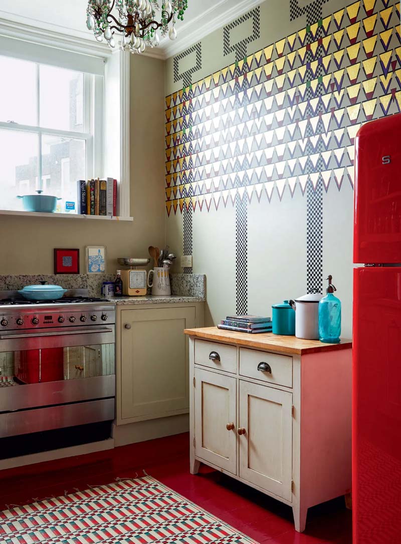
With so many ‘hard’ surfaces, a kitchen can be made to feel much less clinical, and therefore more sophisticated, by the addition of fabric and perhaps pattern. Wallpaper is a possibility and can be used to glorious effect. It will last longer if there’s good ventilation, and also if the paper’s either varnished once it’s up (do patch test it first), or you’ve chosen a paper with a vinyl finish (which Lewis & Wood offer on all their patterns).Floors are another area where you can easily add impact – while remembering the necessity of whatever you choose being hard-wearing. Rugs can be added as required or desired. Then there’s the joy of tablecloths, napkins, and cushions on chairs, which, particularly in a kitchen, can carry a frill. Finally, dress windows as you would any other window in the house, and if you are choosing blinds do consider a cut – balloon, or Austrian – that doesn’t sit in a straight line; there are, generally, sufficient of those elsewhere in the room.
And if you still want to find a means of incorporating some marble? Dunelm can deliver it at a very reasonable price.
See more at House & Garden


